LTA play your way
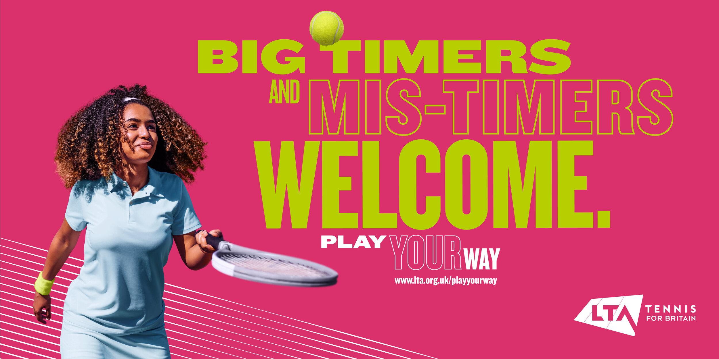
We won the pitch for LTA. They liked the work so much they wanted to run with it and begin to make it part of the master brand look and feel. The brief was to improve perceptions of tennis to make it more accessible and a sport more people see themselves playing. There was limited budget and the visual system has to work hard using project specific shot imagery to existing LTA stock imagery. We wanted to get away from the classic ‘white shorts’ and ‘middle class’ perception of tennis. Using existing LTA brand typefaces and colours we created a lively and energetic type treatment that could work on both still and motion creative .
Role: Head of Design/Typography/Creative Direction
Team: Marc Donaldson/Loty Ray