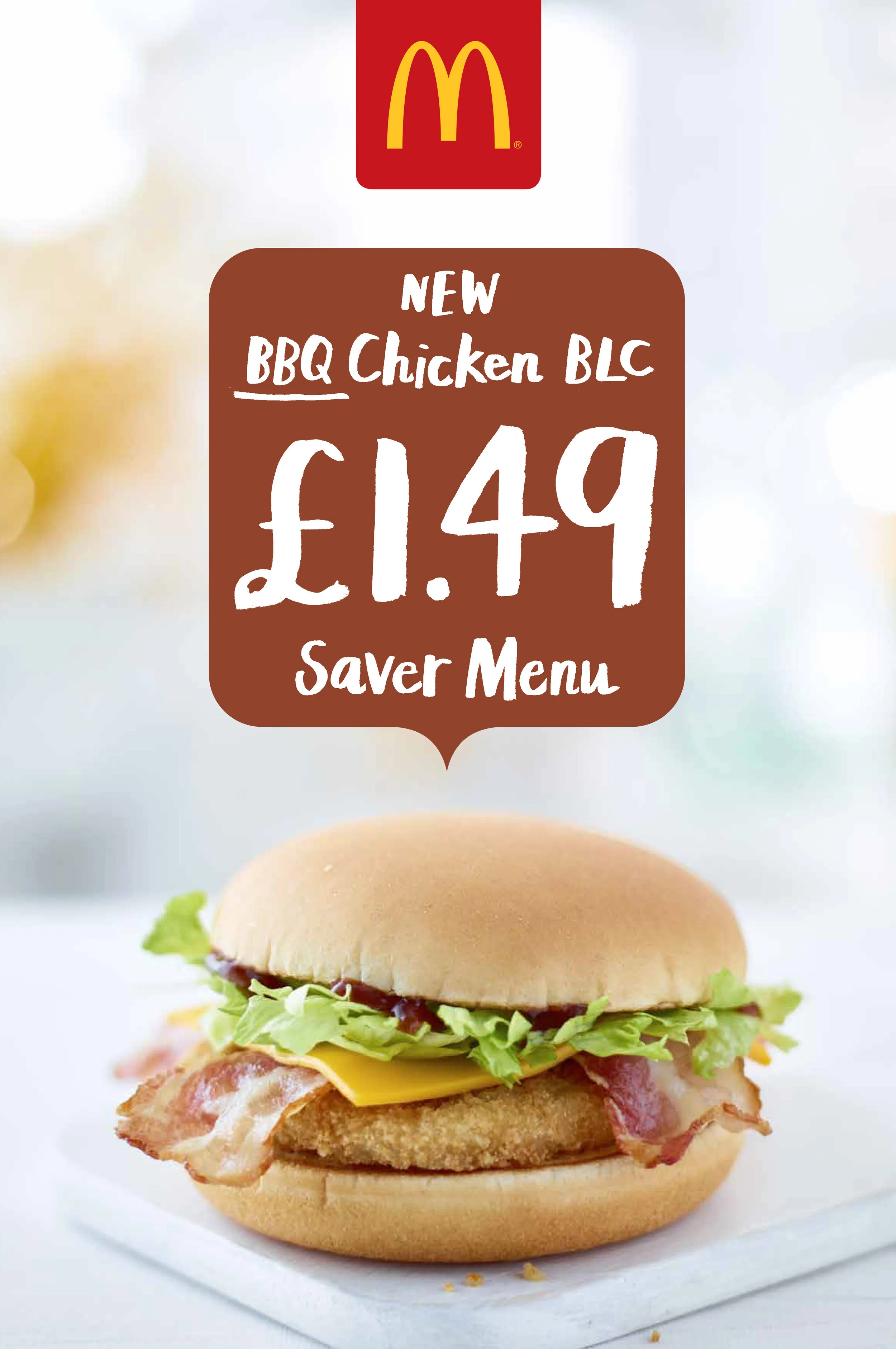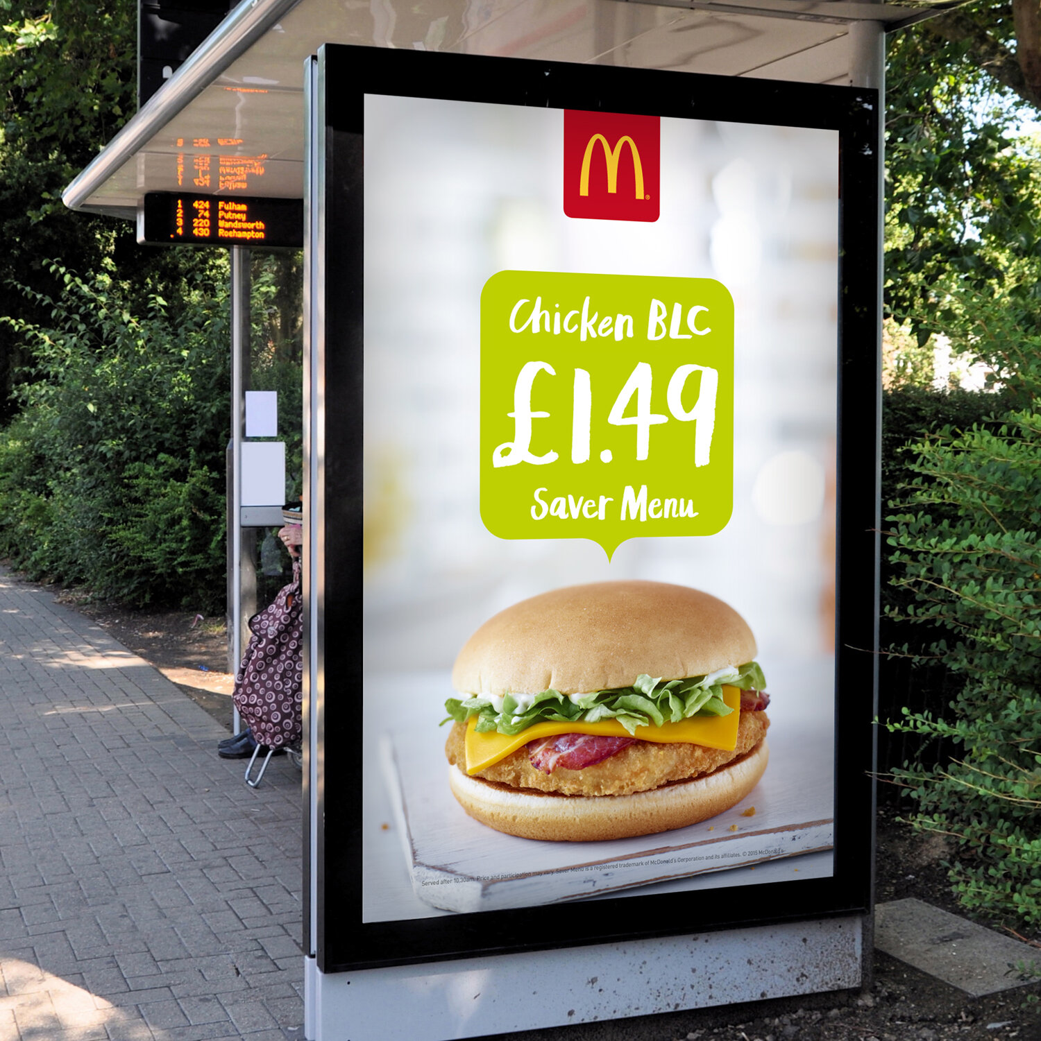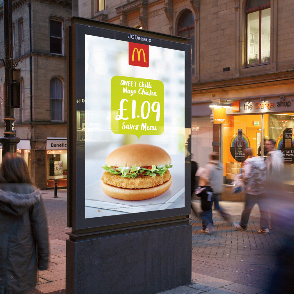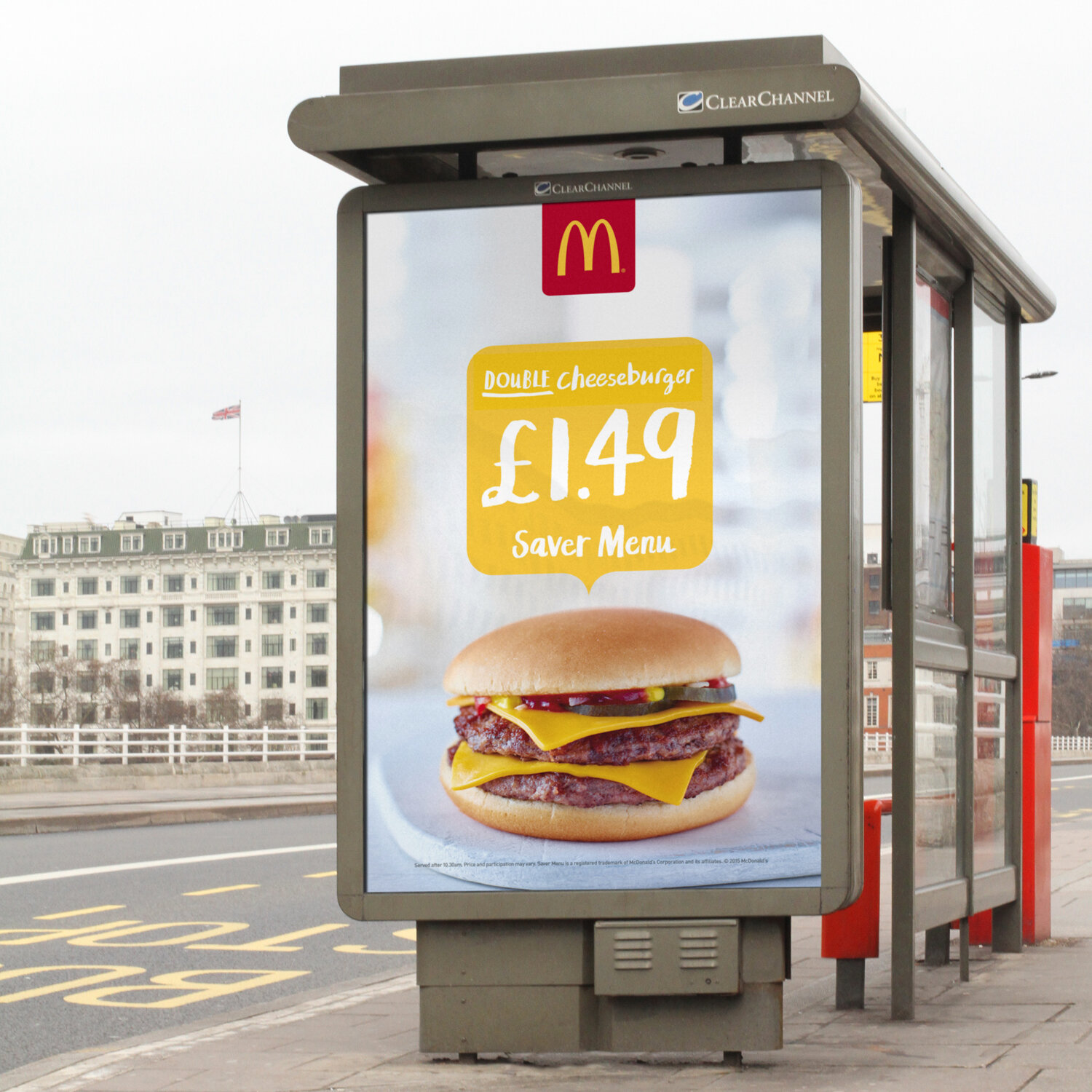
McDonalds Saver Menu
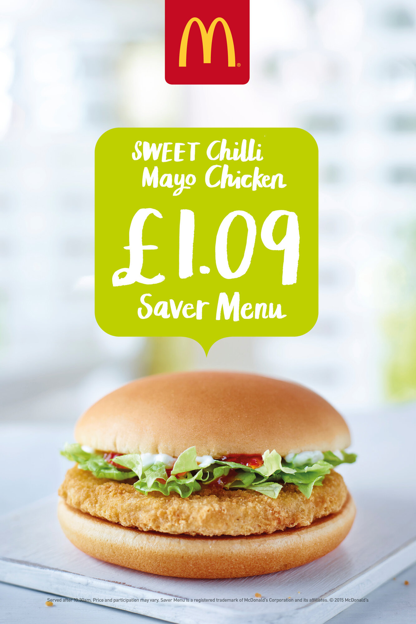
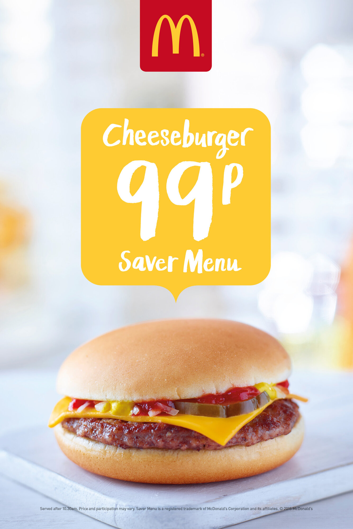
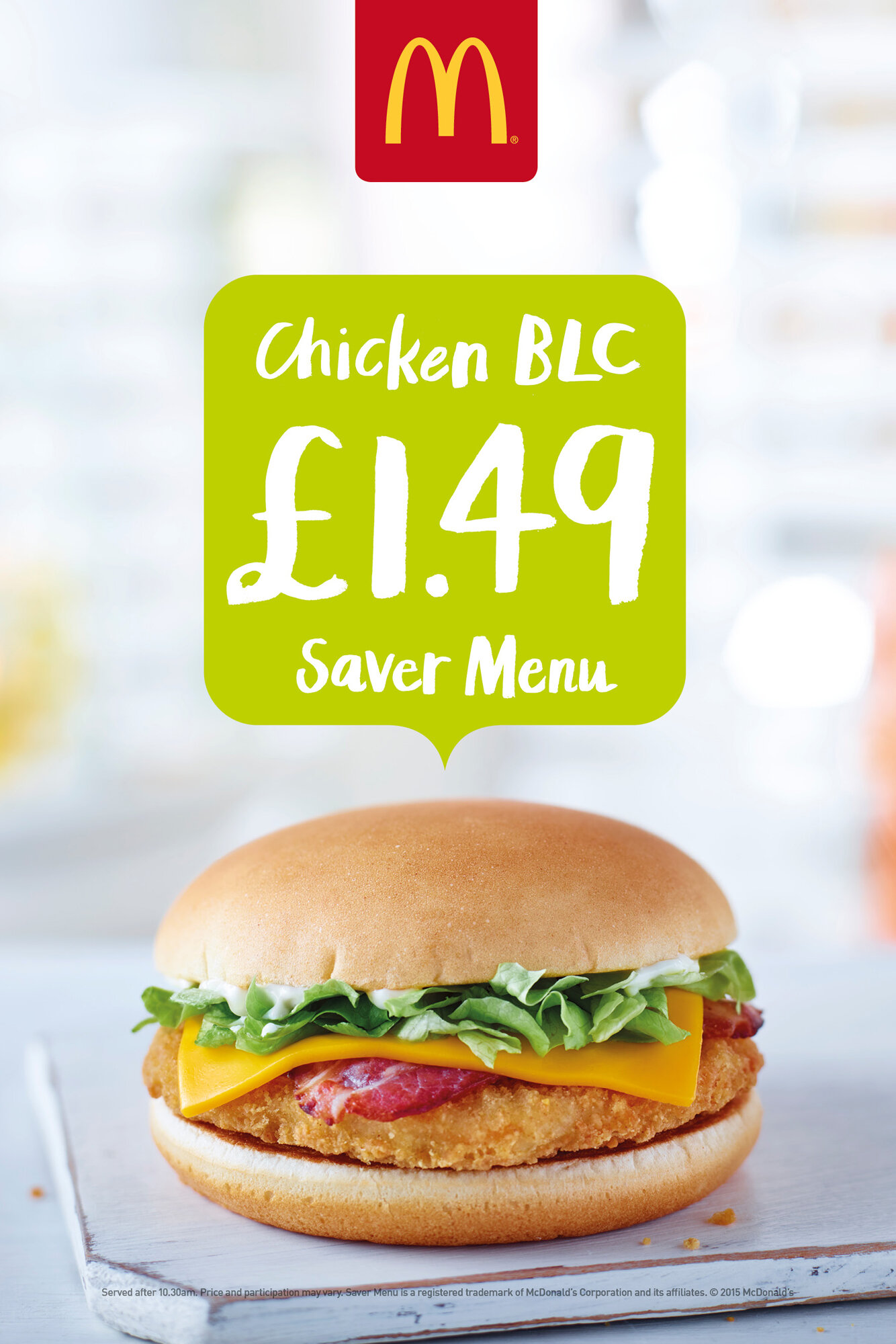
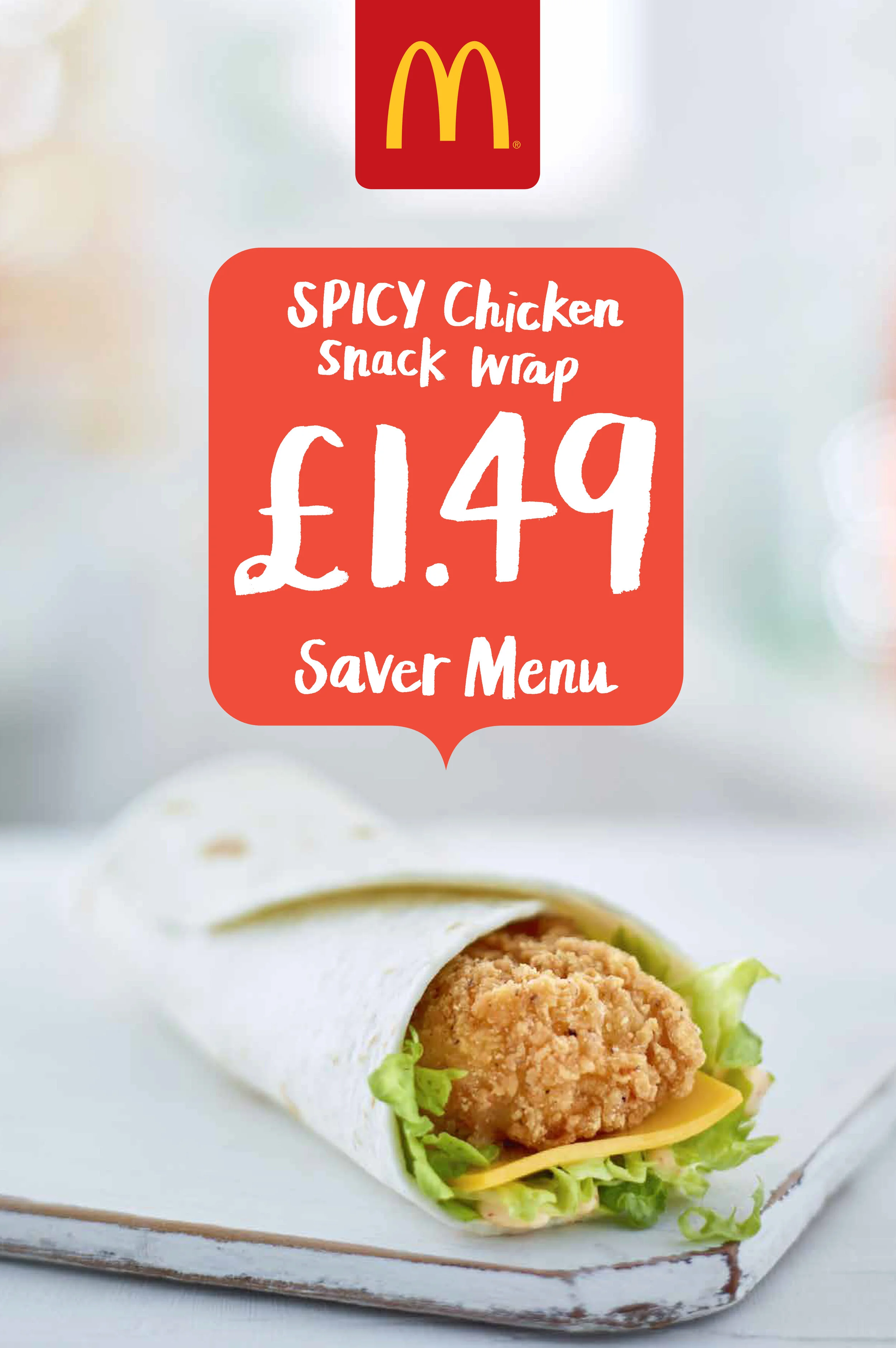
McDonalds wanted to give their saver menu art-direction a refresh. It had to play into the bigger brand refresh strategy and tone-of-voice I was also working on which was ‘down to earth, welcoming and up-beat’. I used a simple geo-tag style graphic, informed by the curve of the Golden Arches, along with a complimentary colour palette to make these posters pop. Some wonderful brush typography from Marion Deuchars helped make them feel fresh and personal. And my new vision of more realistic product shots was brought to life with help from the talented Myles New. Sales of the saver menu increased with the launch of the new art directional and 6 years later they are still going strong!
Role: Head of Design/Typography/Creative Direction
Team: Marc Donaldson
Photography: Myles New
Typographer: Marion Deuchars