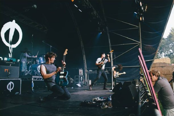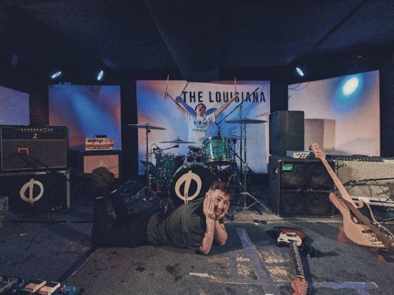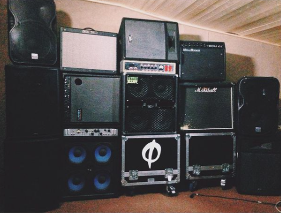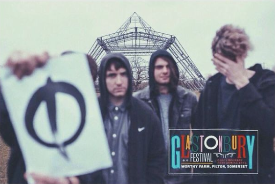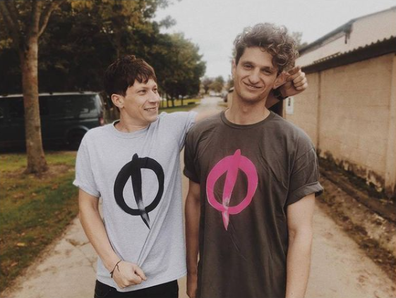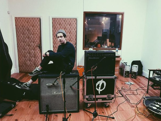
October Drift
Opting to remain ambiguous and to only exist outside of the internet/social media, newly-formed foursome, October Drift approached me to create a whole new identity for them. The idea was to create almost a cult like symbol which could be easily created by fans across the UK. This logo was then used on all new releases with only the colour to differentiate between singles.
Client: October drift
Role: Design/Typography/Co-art direction